This may have been released almost exactly a year ago today but I’ve not managed to get my mitts on this beauty. Until now. And low and behold, it’s even more beautiful in the flesh. The eyeshadow palette consists of 15 shades which are a mix of mattes and buttery shimmers, and also a perfect mix of warm and cool tones. There is a shade for in this palette. Let’s take a closer look shall we…
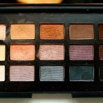
This caters for both neutral eye lovers, myself included, and those who like a bit of colour. Whilst there is colour in this palette, from the soft plummy hues to the cool toned teal, the colours are somewhat muted, and ironically neutralised, making them much more versatile and therefore much more appealing to the masses. A mix of mattes, pearlescent shimmers and even a few sparkly, glittery shades.
Let’s go through each shade one at a time and see how they perform.
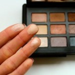
Top row, left to right:
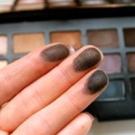
All About Eve is described as a ‘flesh toned neutral’ although it is lighter and much more pink than my skin, which kind of reminds me of Mac Naked Lunch (although upon a closer, side by side comparison, Naked Lunch is much paler). It has a rather frosty finish with tiny micro glittery particles which reflects beautifully in the light. This glides on the skin rather smoothly and also evenly, and would look great as an inner corner highlight on some or in the centre of the lid to make the eyes really pop.
Madrague #2 is described as a ‘matte caramel’ which I’d say is quite accurate although it veers on the cool side of caramel. This is a couple shades darker than my own skin tone and I’ve been using this a lot as a transition/crease colour. This doesn’t apply as smooth or evenly and requires dipping in a few more times to get the completely even and opaque finish. Having said that, it’s not chalky nor does it suffer from fall out so it’s fairly easy to work with.
Fez is described as a ‘velvety cocoa’ and is one of my favourites, if not my favourite, from the palette. It’s a metallic bronze shade and definitely one of the more warmer shades out of the fifteen. It’s consistency is beautiful as it glides on smooth (and dare I say ‘buttery’) and the payoff is intensely opaque, providing a beautiful sheen on the eye.
Bali is described as a ‘neutral’ which is probably the most ‘blah’ name I’ve ever come across. Yes it is a neutral tone as are a few others in the palette but I would best describe this as a cool toned medium to dark brown. Although very pigmented, the powder does struggle to apply consistently and for an all over even payoff, you may need to dip into it several times. Don’t let this shade put you off though because the pigment is there. I like to use this to intensify the eye and works great in the crease or the outer V.
Coconut Grove is described as a ‘ deep brown infused with reflections’. When I first saw this shade, I wasn’t sure whether some of the glitter particles from the shade below had transferred onto it. It’s a much more darker, matte brown than Bali and perhaps a tad warmer too, although I’m not sure what the point of the ‘infused reflections’ a.k.a. glittery particles are, because it barely transfers when on the eye. It makes for an interesting swatch but that’s about it. I found this to be similar to Bali in both texture and consistency. The pigment is there, it just takes a little bit of work to get it on evenly.
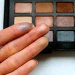
Middle row, left to right:
Madrague #1 is described as a ‘Matte Cream’ and has a slight yellow under tone. This is incredibly soft and just a shade lighter that my skin tone and one for a subtle brow bone highlight. Again, as with the other mattes mentioned, you need to build to get complete opacity and an even finish.
Nepal is described as a ‘soft sheer rose’ and is a very pretty, pearlescent peach. It’s a gorgeously creamy texture that blends like a dream and gives a sheer but even touch of warmth to the eye.
Ashes to Ashes is described as a ‘Shimmery violet based brown’. I think having the word brown to describe this colour sends completely the wrong message. It’s more of a neutralised, muted violet and one of the more interesting and unusual colours in the palette( and in general). You could team this with a darker plum shade to rely bring out the purple tones in it or with a brown colour to enhance the earthy tones in it. Truly unique yet versatile.
Brousse #2 is described as a ‘Black violet’ which is an accurate description for how dark this plum tone is. It actually looks more purple in the pan than it really is. When applied, it’s more of a very dark brown with a hint of purple to it. The texture isn’t anywhere near as smooth or buttery as some of the others mentioned and this is reflected in the payoff as it doesn’t apply very evenly. There are also some tiny micro glitter particles in it that is more evident here than in the shade Coconut Grove, although still rather subtle on the eye.
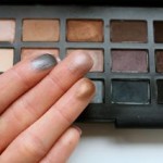
Mekong is described as an ‘expresso infused with shimmer’. Lots of shimmer! It’s a very dark brown, much deeper than Coconut Grove with a matte finish. However, it’s infusion of red sparkles is much, much more prominent. For me, this matte packed more of a punch than the mattes already mentioned, maybe that’s got something to do with the infused shimmer, but it applied more evenly on the eye.
Belissima is described as a ‘Shimmering beige with subtle glitter’. I’m not too sure about subtle! It’s very blatantly visible. The payoff is good for such a pale colour and it’s texture was easy to work with, not quite as buttery some of the aforementioned though. It’s more of an off white than a beige though too.
Lhasa is described as a ‘lavender grey’ which is a plum toned taupe with a frosted finish. This doesn’t apply as evenly as some of the others already mentioned although the texture still feels lovely and rather creamy. This colour payoff isn’t as good as I had hope though.
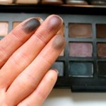
Bad Behaviour is described as a ‘Deep pewter’ or in other words a beautiful, rich teal infused with shimmery particles. The colour payoff is pretty decent and it applies rather evenly which is such a shame because I don’t think I’d ever be bold enough to wear this shade. Hmmm…maybe along the bottom lashes for a pop of colour? maybe…..
Dogon #2 is described as a ‘Charcoal’ but I think it’s a bit more interesting than that. This shade is rather deceptive as it does look a lot more blue in the pan. When swatched, it’s extremely dark but has an ever so slight hint of a cool blue in there. Again, it’s another shade that has a little shimmer to it, but very subtle that it barely transfers. It’s incredibly pigmented but maybe not as soft as some of the other mattes we’ve seen earlier, but that might be down to the infused shimmer.
Pandora is described as a ‘matte black’ and whilst it is a matte black, it’s performance is lacking. For a black shadow, it needs to pack a punch but this was a little wishy-washy. Although soft and smooth for a matte, the payoff isn’t there and it fails to apply evenly.